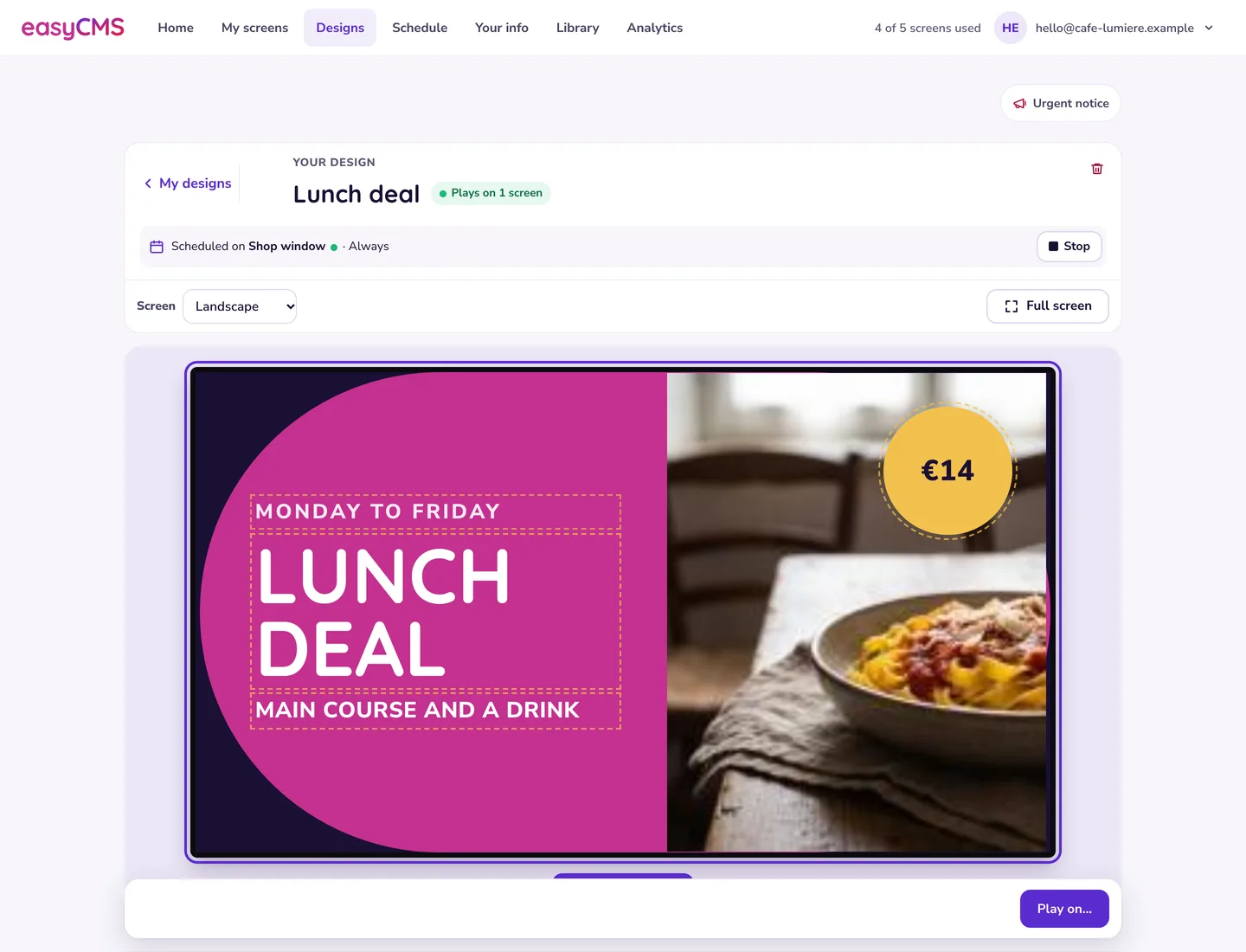
For almost every screen you will ever install, the answer is 1920 x 1080 for landscape, 1080 x 1920 for portrait, JPEG or PNG for stills, and MP4 with H.264 video and AAC audio for anything that moves. Design at the exact pixel size of the panel, not bigger. Everything below is the detail behind that, in the order you will need it.
This is the reference page. Bookmark it, send it to whoever makes your artwork, and come back when someone hands you a 4K vertical wall or a 4:3 panel from 2011.
The working standard: 1920 x 1080
Full HD is the resolution of the overwhelming majority of commercial signage panels sold, and it is what most of your content should be built at. It is 16:9, every design tool defaults to it, and every player platform we support handles it without effort.
The habit worth forming is to build artwork at the panel’s real pixel size rather than at some larger “safe” size. Designers trained on print reach instinctively for 300 DPI or a 4000 pixel export, and on a screen that helps nobody. Three things go wrong when you design big and let the player scale down.
Text goes soft. A headline drawn crisply at 4000 pixels wide and then resampled to 1920 loses the hinting that made it sharp. Type set at its final size stays sharp because nothing resamples it.
You burn storage you paid for. A 4000 x 3000 photo off a camera is often 10MB or more. The same picture cropped to 1920 x 1080 and saved as a quality 82 JPEG is usually under 500KB. Same screen, same result, twenty times the file.
The player works harder for nothing. Every image is downloaded, held and decoded on the device. On a low-cost Android box, oversized stills are a genuine cause of stutter between items.
Tip If your estate is mixed and you do not know every panel’s native resolution, standardise on 1920 x 1080. Downscaling is clean and predictable. Upscaling a 1366 x 768 asset onto a Full HD panel is visibly soft, and there is no fixing it after the fact.
Landscape, portrait and the 4:3 you will still meet
Aspect ratio decides whether your content looks designed or looks stretched. Get it right at the canvas stage and nothing downstream can go badly wrong.
| Layout | Canvas | Aspect | Where you meet it |
|---|---|---|---|
| Standard landscape | 1920 x 1080 | 16:9 | The default for almost everything |
| Standard portrait | 1080 x 1920 | 9:16 | Entrances, lifts, menu boards, retail totems |
| 4K landscape | 3840 x 2160 | 16:9 | Large panels read from close up |
| 4K portrait | 2160 x 3840 | 9:16 | Tall totems read from close up |
| HD-ready panel | 1366 x 768 | 16:9 | Older TVs and entry-level commercial panels |
| Legacy landscape | 1024 x 768 | 4:3 | Meeting-room panels, older projectors |
| Legacy portrait | 768 x 1024 | 3:4 | Rare, and always inherited rather than chosen |
| Stretch bar | 1920 x 540 | 32:9 | Shelf edges, above-counter strips, transport |
The 4:3 panels catch people out. They are not sold any more, but plenty are still on walls in schools, town halls and meeting rooms, and a 16:9 design on one gets black bars top and bottom or, worse, gets stretched by the panel’s own scaler until everybody is short and wide. There is no clever fix. Build a separate layout at 1024 x 768 and schedule it only to those displays. Fifteen minutes per campaign is the difference between looking deliberate and looking broken.
Watch out Never let the display’s own scaler decide your aspect ratio. Set the panel’s picture mode to the option that maps pixels one to one, often called “Just Scan”, “Screen Fit”, “1:1” or “Full”. Overscan quietly eating 3% of every edge is the most common reason a well-built layout looks slightly wrong on the wall.
When 4K is genuinely worth it
4K is worth paying for when the viewer’s eye is close enough to resolve the extra pixels, and worth nothing at all when it is not.
Worth it when: people stand within about two metres, as at wayfinding boards, reception desks, retail product screens and touch panels. Or when the content carries fine detail: dense timetables, price lists, floor plans, product photography where texture matters. Or when the panel is 75 inches and up and people pass it at close range.
Wasted when: the screen is read from four metres or more. A 55 inch panel at four metres is well past the point where a typical eye can tell 4K from Full HD. Wasted too when the content is large type and a logo, and when the source is 1080p anyway. A 4K layout filled with upscaled Full HD video is a 4K file size with a Full HD picture.
Being wrong in the expensive direction costs you. A 4K asset is four times the pixel count and in practice three to four times the file size, so it eats storage, download time and decode headroom. Confirm the player can drive 4K first: a 4K layout on a device that only outputs Full HD is worse than a Full HD layout done properly. Our player overview covers what each platform handles.
Viewing distance to text height
The working rule is about 25mm of capital letter height for every 3 metres of viewing distance. That is a legibility floor, not a comfort target, so for content people read while walking, go one row further down than you think you need. The pixel columns show what that height means on a Full HD canvas at three panel sizes: the same physical letter needs fewer pixels on a bigger panel, because each pixel is physically larger.
| Viewing distance | Minimum cap height | px on 43” FHD | px on 55” FHD | px on 75” FHD |
|---|---|---|---|---|
| 1.5 m | 13 mm | 26 | 21 | 15 |
| 2 m | 17 mm | 35 | 27 | 20 |
| 3 m | 25 mm | 51 | 40 | 29 |
| 4 m | 33 mm | 67 | 53 | 39 |
| 6 m | 50 mm | 101 | 79 | 58 |
| 8 m | 67 mm | 136 | 106 | 78 |
| 10 m | 83 mm | 168 | 131 | 96 |
A 55 inch panel across a canteen at 8 metres needs body text around 106 pixels tall, a cap height of roughly a tenth of the screen height, which with normal line spacing leaves room for about six lines on the whole screen. If your design has twelve, that is a distance problem rather than a design problem, and the answer is fewer words, not smaller type.
Remember that cap height is not font size. A typeface set at 100pt usually has a cap height nearer 70pt. Measure the capital letter on screen, not the number in the size box.
Good to know Contrast does more for legibility at distance than size does. Dark text on light, or light text on a genuinely dark background, reads from further away than any mid-tone pairing at the same size. Thin and light font weights fall apart long before regular weights do.
Safe file formats and settings
Stick to this list and you will not meet a playback problem caused by the file itself.
| Asset type | Format | Settings that work |
|---|---|---|
| Photographs | JPEG | Quality 80 to 85, sRGB colour, exact pixel size, no embedded thumbnail |
| Flat graphics, logos, text-heavy slides | PNG-24 | sRGB, exact pixel size. Use where you need transparency or crisp edges |
| Video | MP4 | H.264 video, AAC audio, progressive scan, exact pixel size |
| Documents | PDF widget | Export at screen size, not A4, or expect to squint |
| Type | Custom fonts | Upload the font rather than relying on what is on the device |
Avoid TIFF, BMP, PNG exports of photographs, and animated GIF where a short MP4 would do. A GIF loop is almost always larger and lower quality than the same clip in H.264.
For video, these are sensible starting bitrates. Encode once at the target rather than re-encoding an already-compressed file.
| Content | Resolution | Frame rate | Video bitrate | File size per 30s |
|---|---|---|---|---|
| Slides with gentle motion | 1920 x 1080 | 25 or 30 fps | 4 Mbps | 15 MB |
| Typical promo video | 1920 x 1080 | 25 or 30 fps | 8 Mbps | 30 MB |
| Fast motion, sport, particles | 1920 x 1080 | 50 or 60 fps | 14 Mbps | 53 MB |
| 4K promo | 3840 x 2160 | 25 or 30 fps | 30 Mbps | 113 MB |
Audio, where you need it at all, is 128 kbps AAC stereo. Most signage runs silent. If yours does, export with no audio track and save the space.
Three encoding rules prevent most video faults.
Progressive, never interlaced. If your source is 1080i, from a broadcast feed or an older camera, deinterlace it on export. Interlaced content on a progressive panel produces combing artefacts on every horizontal movement.
Constant frame rate. Phone recordings are frequently variable frame rate, which players handle inconsistently. Force a constant 25 or 30 fps.
Keep the source frame rate. European material shot at 25 fps stays at 25. Converting it to 30 introduces judder for no benefit. If a clip stutters on the wall, start with video playback problems before blaming the hardware.
Why a huge source file is a liability
Storage on your account is finite and so is the player’s patience. The easyCMS standard account includes 1GB of cloud storage, PRO 5GB, Enterprise 20GB.
Run that against the video table. On 1GB you can hold roughly thirty 30-second promos at 8 Mbps, sixty at 4 Mbps, or around 2,000 well-compressed Full HD stills. One 30-second 4K promo at 30 Mbps takes 113MB, more than a tenth of the whole standard quota, to fill a screen most people watch from six metres away.
It pays off on the device too. Players cache content locally so they keep playing when the network drops, and tightly encoded files download faster and leave more headroom on a modest Android box. There is more in digital signage storage requirements and in storage quota and media uploads.
The honest concession: Yodeck lists unlimited storage on its free single-screen plan, and OptiSigns lists unlimited storage from its Standard plan upwards, though its own free tier is capped at 1GB (both from each vendor’s pricing page, checked September 2026). If your content really is a large library of long-form 4K video, a metered lifetime account is the wrong shape and a subscription with unmetered storage is the better buy.
Portrait: rotate the content, not the panel in the OS
Portrait screens are common, and they are where the most avoidable mistakes happen.
The correct approach is a layout whose canvas is 1080 x 1920, with everything designed natively vertical. The layout carries the orientation, your assets are cut to 1080 x 1920, and the panel is mounted rotated on the bracket. Nothing is spun by software at playback time.
The wrong approach, reached for because it is quicker, is to build a 1920 x 1080 landscape layout and rotate the whole desktop 90 degrees in the player operating system. It sometimes appears to work. It also produces soft video on hardware that cannot rotate a decoded frame efficiently, breaks touch coordinates on interactive screens, and leaves you with content nobody can preview correctly.
Some player hardware does need its own display rotation set once, so the desktop matches the physical panel. That is a one-time hardware step, not a substitute for the right canvas. Screen resolution and orientation covers it per platform, and creating layouts covers the canvas.
Two practical notes. Check the panel is rated for portrait mounting, because not every commercial display is and heat rises differently on its side. And budget more for the bracket, since portrait mounts cost meaningfully more. Both feed into the cost per screen breakdown.
Multi-zone layouts: design each zone at its real size
A multi-zone layout divides the canvas into regions, each running its own playlist. One rule makes them look professional: work out the exact pixel size of every zone and produce artwork at that size. A common three-zone Full HD layout:
| Zone | Purpose | Pixel size | Make your assets at |
|---|---|---|---|
| Main | Video and promotions | 1440 x 810 | 1440 x 810 |
| Sidebar | Prices, menu, QR code | 480 x 810 | 480 x 810 |
| Ticker | Headlines, alerts, clock | 1920 x 270 | 1920 x 270 |
The zones add up exactly: 1440 plus 480 is 1920 across, 810 plus 270 is 1080 down. Everything in the main zone is built as a 1440 x 810 asset, not a 1920 x 1080 one cropped by the player.
Sizing zones by eye produces the classic multi-zone failure: a video with black bars down both sides inside a region with a slightly different ratio, or a logo cropped just enough to look like a mistake. Write the numbers down before you open the design tool.
Two more points. Live widgets such as weather, RSS or an embedded webpage belong in their own zone rather than owning the whole screen, so an outage leaves a gap rather than a blank display. And check every text zone against the distance table, because a sidebar 480 pixels wide is a much smaller physical area than the number suggests.
LED walls: the resolution is whatever the wall is
An LED wall has no standard resolution. Its pixel count is whatever the cabinet arrangement produces, and your canvas has to match it exactly.
Work it from the pitch. A 3.9mm pitch cabinet measuring 500 x 500mm is 128 x 128 pixels. Six cabinets across and three high gives a wall 3 metres by 1.5 metres, and a canvas of 768 x 384 pixels. That is a physically large wall with fewer pixels than a phone from a decade ago. Three consequences.
Set the layout canvas to the wall’s exact pixel dimensions. Not 1920 x 1080 scaled down by the processor. Every scaling step on a low-resolution wall is visible.
Type has to be enormous in pixel terms and simple in shape. On a 384 pixel tall canvas, a headline filling a fifth of the height is 77 pixels. Thin strokes, serifs, tight letter spacing and small logos all disappear. Use bold weights and generous spacing.
Preview at 100%, then walk away from the monitor. Content that looks crude at arm’s length on a laptop often reads perfectly at 15 metres. Judging it at the wrong distance is the usual mistake.
The design side is covered in content creation for LED displays, the hardware side in LED displays for digital signage. One note on LCD video walls, where several panels are tiled into one image: synchronised video walls are supported on Android players only. Plan the platform around that rather than discovering it after mounting.
Templates, and the fastest way to size a still
easyCMS gives you layout templates, so you build a canvas once and reuse its structure. What it does not give you is a gallery of ready-made designs to browse and drop in, which Yodeck, for one, does include — 800+ templates listed on its own pricing page, checked September 2026 — and which is a fair reason some teams pick them. If you want to start from someone else’s finished design, look elsewhere.
Most of what goes on the screen is a still image, and most of the trouble in this article comes from stills made at the wrong size. So write the canvas size down before you start, and export from whatever design tool you already use at exactly that pixel size rather than resizing afterwards. Creating layouts shows where each canvas and zone size is set.
If you are unsure what canvas your estate needs, the support guides cover it, and an expert hour is €25 if you want a person on it. Send us the panel model and the viewing distance and we will tell you what to build at.
Related reading: digital signage storage requirements, content creation for LED displays, and the guide to creating layouts.