Guide: how to create content for led Displays in 13 steps.
Hey, are you looking for Some great Tips on Content Creation For Outdoor and Indoor LED Displays screens? Learn how to get best results for your next advertising campaign. Here are best practices for Digital Signage Content creation.
We have another post on how to create content for free without any photoshop skills. We highly recommend you check it out.
1. Test Content Before Installation
Each LED Display screen is different. Prior to creating content, make sure to test it with our template to check the readability and render of images, colours and texts. It will allow you to make sure that you content always looks as intended. => Download our custom template and test images here!
2. Display Technical Data
Before you can start creating the content you need to know basic informations. For example, the display resolution, Pixel Pitch, Minimum Viewing Distance, Environnement,…Eventually, all technical data that can affect the visual impact of the content you are creating. Each digital display is different, so your content must be tailored for each screen.
| Pixel Pitch | 10mm |
| Display Resolution | 384×192 pixels |
| Minimum Viewing Distance | 20m |
| Environnement | By the road |
3. Exact Pixel Size
In Content Creation For LED Displays it is important to respect the exact pixel size of the screen. We recommend to avoid software automatic scaling of images and videos. It is best to create content with the exact pixel resolution of the electronic sign, it will offer best quality and viewing experience for target audience. Tests have proven that increasing the image size will not specially improve quality – to the contrary. To help you calculate the Resolution, check out this video and learn about the Pixel pitch.
4. Avoid Bright Colors
Make sure you don’t use any bright colors like white or red for full screen background. This can cause many issues. First, if used often, it will reduce the lifespan of the LED digital sign. Furthermore, it will certainly use more electricity. Finally, it will be too bright for your target audience to look at. And that is the main goal, get people to look at your electronic sign. Potentially, it can cause more severe issues, like distracting drivers, and cause accidents. To solve this, we recommend to always use darker and softer colours for your backgrounds.
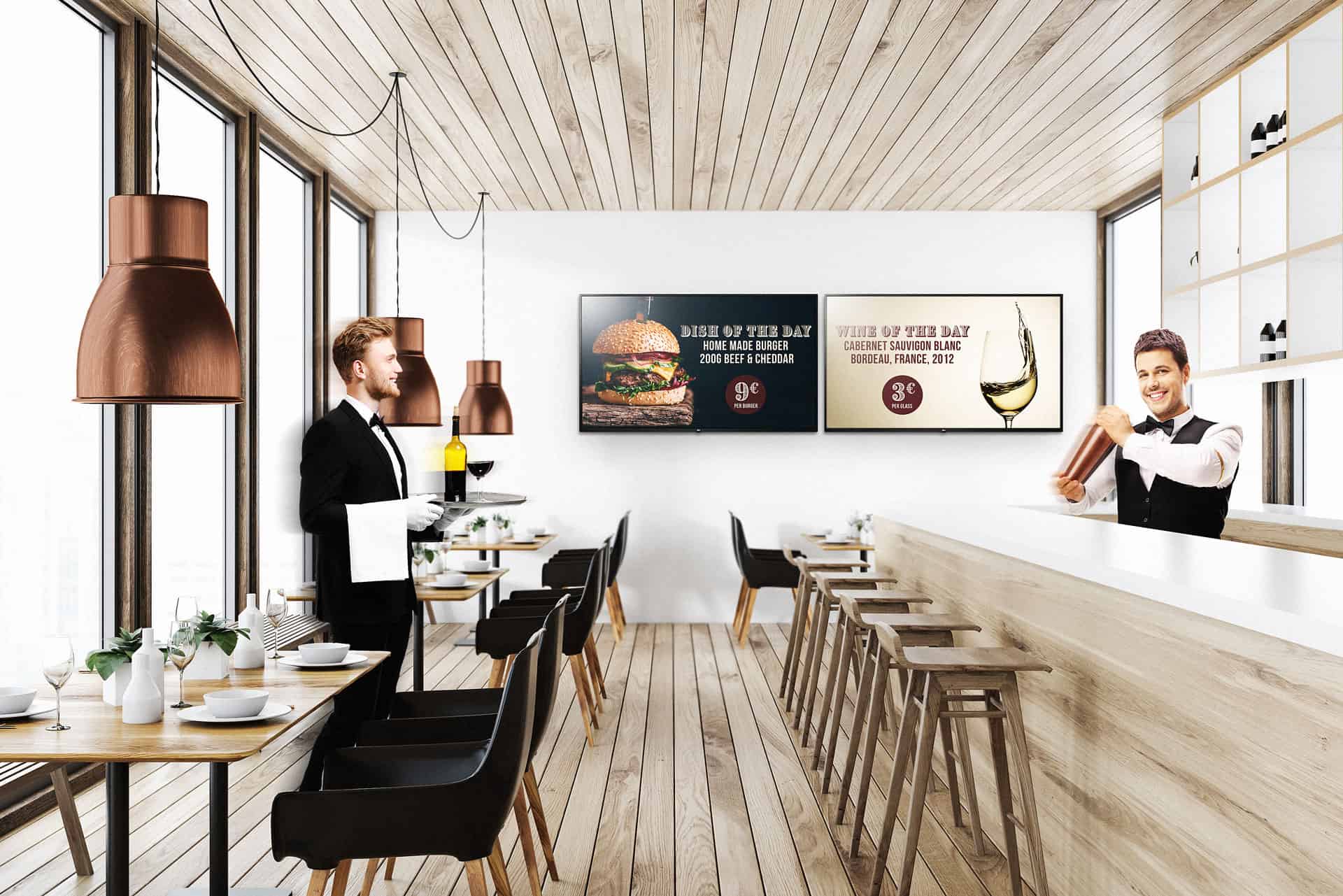
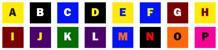
5. Use contrasting colors
To make sure your text is clearly visible, You will need to research how your company branding can be used on Digital Signs. There is some combinations of colours that work better for digital signage. these colours will offer better readability, and be more pleasant to the eye. Here are a few examples of good combinations; black on yellow, yellow on black, white on blue, yellow on blue, white on green, …
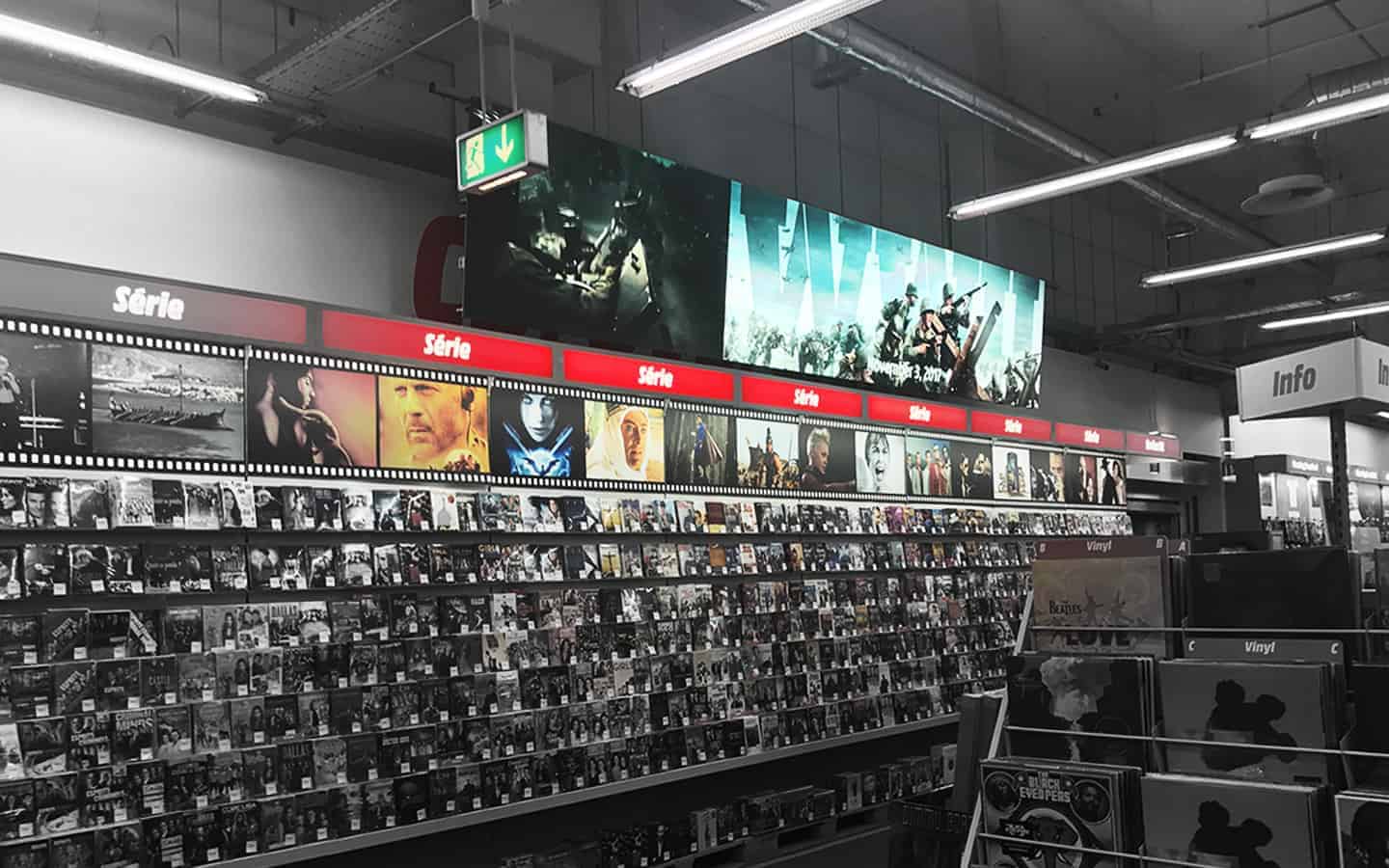
6. Use Few Words
Very often, your audience will need to get the message very quickly. It is likely that your advertising board is by the road or where people walk by fast. This is why we recommend to use as less words as possible. Your message should be short, clear and make directly sense. Usually 5 to 10 words maximum per sentence. Don’t forget that you audience may be driving by or walking by very fast.
7. Make text readable
To get bets readability effect, we recommend the use common fonts like Arial, Helvetica, Verdana, … This is what is generally called “Sans Serif”. In other words, Your text must be BIG and Crisp. Avoid any use of drop shadow, bevel, glow or other text effects. and don’t forget to use the recommended contrasting colours for maximum readability.

8. No Text On Images
One thing that often happens is the mixing of text and images or videos. This is because the medium allows for many creative possibilities. But always make sure you separate text from images. They must never overlap. Mixing them will certainly make your message unreadable for your target audience. To solve this, create a separate slide for text or divide your canvas in zones. Alternatively, you can try to find creative ways to get your text to stand out. By having your text clearly visible, your composition will look more professional and will be readable for your audience.

9. Keep it Simple
Of course, your content needs to be original, creative and generate attention. But at the same time it needs to be simple. Never forget that your audience has a very short time to see and memorise your message. We strongly recommend to get rid go the clutter and unnecessary content. This needs to get out of the composition. one key advice to remember is “Less is more!”.
10. Reduce Motion
Outdoor and indoor led sign boards are great marketing tool. They allow for videos, images, animation,… This is why when creating content for digital displays designers will often add a lot of animations to their composition. Of course it looks great on the preview, but unfortunately it will often distract your target audience from the key message. They might be watching the display when the animation is only taking place and cannot actually see what is the message. This is why we recommend to avoid text animations especially.
11. Timing
This is very key factor in successful adverting campaign and even information boards. In TV advertising, total length can vary between 20 to 60 seconds. But in Digital Signage, average is 10 seconds for an ad. very often it will be no more than 6 seconds. When creating a campaign, slides should be in average 3 seconds long, otherwise, your audience may not be able to get your message, or may be bored to watch the digital sign.
12. Smooth Transitions
When switching from one video to the other or one image to the next, use simple transitions. Again, it is very common to see “crazy” effects that will look great to the eye, but are actually distracting for your target audience. Always keep it simple, fade in and fade our are usually the best choices for transitions. It should be very subtle, yet the transition should be noticeable.
13. Go&See
Our final advice to improve your content over time is: go and see the results on location. It is the best and only way to check the quality and impact of your campaign. it will help you address any issues that you may notice on site. If you are a professional, make sure you have at least one person dedicated to creating your content or checking it, because experience is key.